- Di 20 März 2018
- MetaAnalysis
- Peter Schuhmacher
- #diagnostic tests, #screening
The output of a dignostic test is often not binary but continuous. Diagnostic information is obtained from a multitude of sources, including imaging, biochemical technologies, pathological investigations , amm. The transformation of the continuous output into a binary variable influences the outcome of the test.
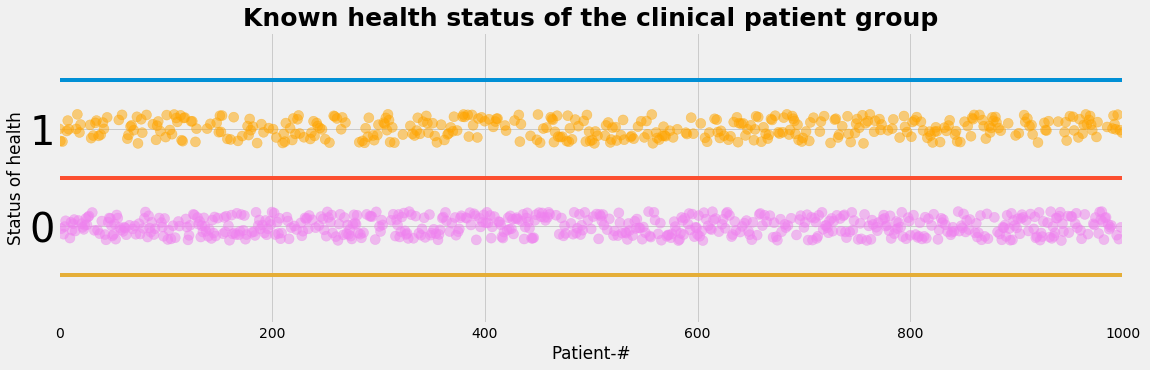
Let's assume we have a study population of 1000 peoples:
- 400 are identified as ill by some independent gold standard methods
- 600 are volunteers identified as healthy by the same gold standard methods
We assume that the status of health is known:
- so the status of health is an observable layer
- we have the perspective of the diagnostic test: given a group of persons that ARE ill, what is the ability (= probablilty) of the diagnostic test to detect the disease \(\mathbf{P(test=positive \mid ill)}\).
Note that in medical practice the perspective changes:
- the health status will be the hidden layer
- We will have the patient's perspective: given a test that is positive, what is the probablity that the patient IS ill \(\mathbf{P(ill \mid test=positive)}\)
We generate now the data set of the population:
plot_status()
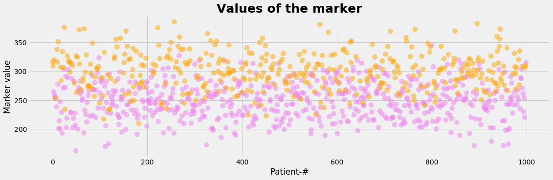
Let's assume, that the diagnostic test is based on a measurable indicator. Such an indicator that correlates to the status of health is called marker. The marker is assumed to be continous and may accept any value in a certain interval. So we are faced with the following problems:
- Measured values cannot be translated directely into a binary variable. So a cutoff point has to be choosen in order to decide wether the diagnostic test tells us 'healthy' or 'ill'.
- The range of value of the marker for the healthy and for the sick may overlap.
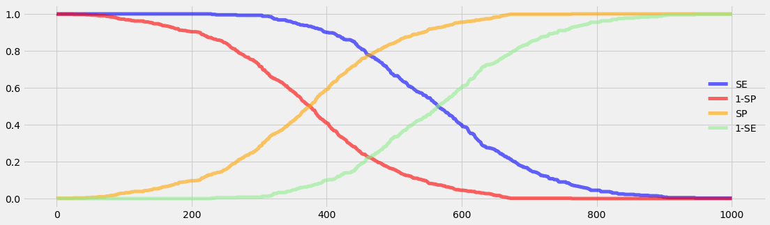
- The cutoff level determins the sensitivity and the specificity of the test which determins the rates of the true positive, false positive, true negative and false negative cases.
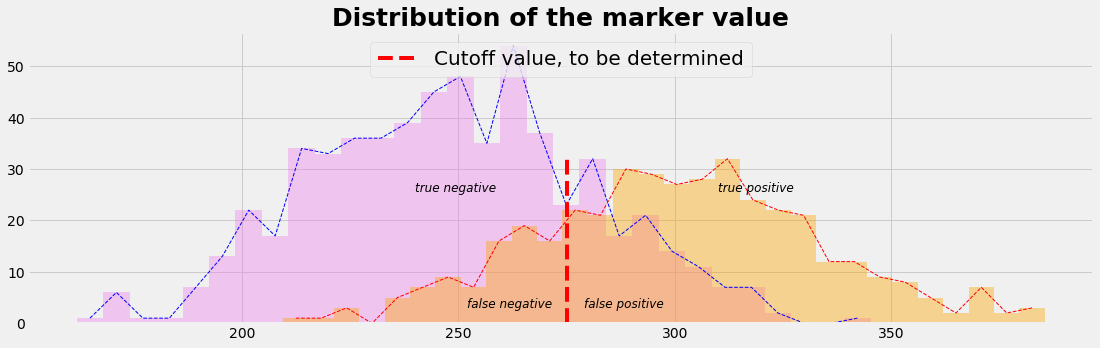
We generate now by a normal distribution the marker values of the study population with mean=250 for the healthy and mean=300 for the sick using the same standard deviation=33 for both groups:
plot_value()
plot_value_distr()
What is the target function ?
As a result of the diagnostic test we prefer to have (ROC 1):
- many or only true positive cases --> sensitivity high, preferably 1
- only few or no false positive cases --> (1-specificity) low, preferably 0
At the same time we prefer (ROC 2):
- many or only true negative cases --> specificity high, preferably 1
- only few or no false negative cases --> (1-sensitivity) low, preferably 0
Benefit and Harm
The true positive and the true negative cases are the benefits of the test, while the false negative and the false positive cases cause harm.
- in the false negative case the disease is not detetcted
- in the false positive case the healthy not-a-patient is involved as a patient, exposed to psychological stress, increased analyses or treatments including financial consequences.
The procedure to find an optimal cutoff value
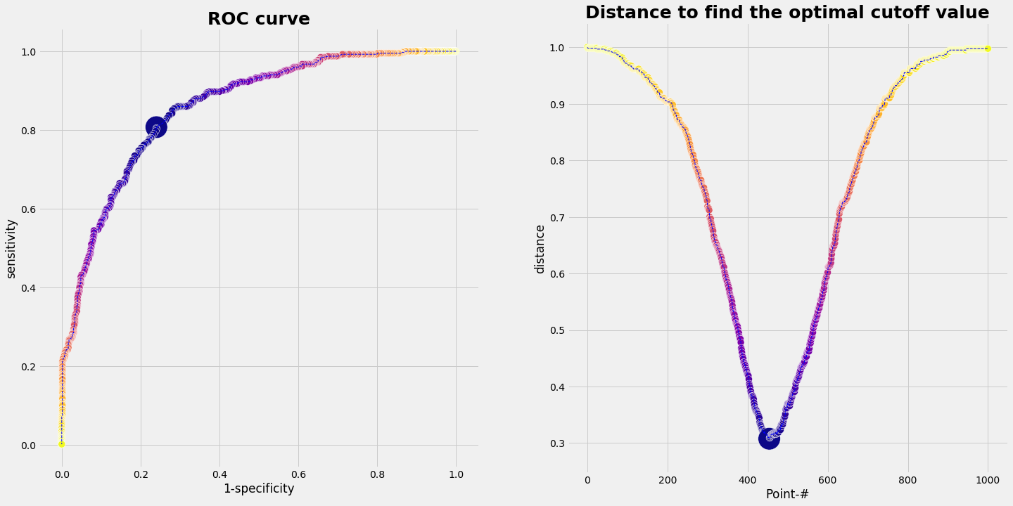
We take the range of values of the marker, which is something between 120 and 400 in our example. We divide that intervall in a sequence of small steps and run through it. For each marker value we do the statistic of our data set (= our population). That means we simply count out how many true positive, false positive, true negative, false negative cases we have. Plotting ROC 1, (1-specificity) vs. sensitivity, gives a graph as shown below.
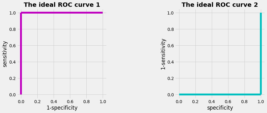
How would an ideal ROC-curve look like ? With the preferred values
- ROC 1: (1-specificity)=0 and sensitivity=1
- ROC 2: specificity=0 and (1-sensitivity)=1
we get the graphs as shown below. The area under the curve (AUC) of an ideal ROC curve would be 1. For a less perfect curve the AUC is less than 1. The overall diagnostic performance of a test can be judged by the AUC.
Since the ROC 1 curve with the population data deviates from the ideal ROC 1 curve, we have to define a procedure to find a cutoff value. There are different methods, e.g.
- using the Euclidian distance
- using the manhatten distance
- including an external utilitiy function depending on the prevalence
We describe the first method, using the Euclidian distance (some others perhaps in later posts)
The upper left corner represents the optimal point. So we can compute how far away each point of the ROC 1 curve form the upper left corner is. The same can be done with the ROC 2 curve and the lower right corner. Formaly this can be accomplished by computing the distance bewteen two points. In vector notation:
gives
From that follows
And from that follows: Using the Euclidian distance as a control to find an optimal cutoff value leads on both ways to the same result.
plot_ideal_ROC()
Result for the example
If we run the data from our example we get the following result:
pd.DataFrame(evalROC_1)
| index of smallest distance | optimal cut off value | sensitivity | smallest distance | specificity | |
|---|---|---|---|---|---|
| 0 | 454 | 271.214565 | 0.8075 | 0.307663 | 0.76 |
plot_ROC(1-SP,SE,'1-specificity','sensitivity',dd_1,dmin_ix_1);

Python Code
import numpy as np
import pandas as pd
import matplotlib.pyplot as plt
import matplotlib.colors as mclr
prev = 0.4
NP = 1000
nI =  round(NP*prev)
nH = NP-nI

L_status = np.zeros(NP)
L_status[nH:] = 1

L_status_nr = np.arange(NP)
np.random.shuffle(L_status_nr)

L_status_color = np.full((NP),'blackblack')
L_status_color[L_status<0.1]='violet'
L_status_color[L_status>0.1]='orange'


L_status_label = np.full((NP),'healthyORill')
L_status_label[L_status<0.1]='hlth'
L_status_label[L_status>0.1]='ill'
def plot_status():
    with plt.style.context('fivethirtyeight'):  # 'fivethirtyeight'
        plt.figure(figsize=(17,5))
        #plt.plot(L_status_nr, L_status, label=" ")
        plt.scatter(L_status_nr, L_status+0.3*(np.random.rand(NP)-0.5), color=L_status_color, s=1/NP*100000, alpha=0.5)
        plt.ylim(-1, 2); plt.xlim(-1, NP)
        y0=-0.5; y1=0.5;y2=1.5
        plt.plot((-1,NP),(y2,y2)); plt.plot((-1,NP),(y1,y1)); plt.plot((-1,NP),(y0,y0))

        tickFontsize=40
        #plt.xticks(L_status_nr);
        plt.yticks(np.arange(2), fontsize = tickFontsize);
        plt.tick_params(which='minor', length=20, width=5)

        plt.xlabel('Patient-#')
        plt.ylabel('Status of health')
        plt.title('Known health status of the clinical patient group', fontsize=25, fontweight='bold')
        #plt.legend(loc='upper center',prop={'size': 20})
        plt.show()
def plot_value():
        with plt.style.context('fivethirtyeight'):  # 'fivethirtyeight'
            plt.figure(figsize=(17,5))
            plt.scatter(xv, value_c, color=L_status_color, s=1/NP*100000, alpha=0.5)
            plt.xlabel('Patient-#')
            plt.ylabel('Marker value')
            plt.title('Values of the marker', fontsize=25, fontweight='bold')
            plt.show()

def plot_value_distr():
    with plt.style.context('fivethirtyeight'):  # 'fivethirtyeight'
        plt.figure(figsize=(17,5))
        nBins=30
        count_h, bins_h, ignored = plt.hist(value_h, nBins, color='violet', alpha=0.4) #histtype='step'
        count_i, bins_i, ignored = plt.hist(value_i, nBins, color='orange', alpha=0.4)

        dxh = np.diff(bins_h)[0]; xh = bins_h[0:-1] + 0.5*dxh
        dxi = np.diff(bins_i)[0]; xi = bins_i[0:-1] + 0.5*dxi
        plt.plot(xh,count_h, ls='--', lw=1, c='b')
        plt.plot(xi,count_i, ls='--', lw=1, c='r')
        plt.plot([mu_m,mu_m],[0,max(count_i)],color='red',ls='--',
                 label="Cutoff value, to be determined")
        plt.text(mu_m+ 4, 3, r"false positive", fontsize=12, fontstyle= 'italic')
        plt.text(mu_m-23, 3, r"false negative", fontsize=12, fontstyle= 'italic')
        plt.text(mu_m+35, 0.8*max(count_i), r"true positive", fontsize=12, fontstyle= 'italic')
        plt.text(mu_m-35, 0.8*max(count_i), r"true negative", fontsize=12, fontstyle= 'italic')

        plt.title('Distribution of the marker value', fontsize=25, fontweight='bold')
        plt.legend(loc='upper center',prop={'size': 20})
        plt.show()
mu_h, sigma_h = 250, 33
mu_i, sigma_i = 300, 33

value_h = np.random.normal(mu_h, sigma_h, nH)
value_i = np.random.normal(mu_i, sigma_i, nI)
value_c = np.concatenate((value_h, value_i))
xv = np.arange(NP)
np.random.shuffle(xv)
mu_m = 0.5*(mu_h + mu_i)
#---- initialize the run ----
cMin = min(value_h)
cMax = max(value_i)
cStep = len(value_h) + len(value_i)
Cuts = np.linspace(cMin,cMax,cStep+1)
ROC = np.zeros_like(Cuts)
SE = np.zeros_like(Cuts)
SP = np.zeros_like(Cuts)
dd_1 = np.zeros_like(Cuts)
dd_2 = np.zeros_like(Cuts)

#---- run through the cutoff levels ----
for ic, vcut in enumerate(Cuts):
    tp = np.sum(np.array(value_i >=vcut, dtype=int))
    fp = np.sum(np.array(value_h >=vcut, dtype=int))

    fn = np.sum(np.array(value_i < vcut, dtype=int))
    tn = np.sum(np.array(value_h < vcut, dtype=int))

    SE[ic] = tp/nI
    SP[ic] = tn/nH
    dd_1[ic] = np.sqrt((0-(1-SP[ic]))**2 + (1-(  SE[ic]))**2)
    dd_2[ic] = np.sqrt((1-(  SP[ic]))**2 + (0-(1-SE[ic]))**2)
    dd_2[ic] = np.sqrt((1-(  SP[ic]))**2 + (0-(1-SE[ic]))**2)

#---- evaluate ROC_1 ----
dmin_ix_1  = np.argmin(dd_1)
dmin_val_1 = np.amin(dd_1)
cut_optimal_1 = Cuts[dmin_ix_1]
SE_optimal_1 = SE[dmin_ix_1]
SP_optimal_1 = SP[dmin_ix_1]
evalROC_1 = {'smallest distance': [dmin_val_1],
           'index of smallest distance' : [dmin_ix_1],
           'optimal cut off value'    : [cut_optimal_1],
           'sensitivity': [SE_optimal_1],
           'specificity': [SP_optimal_1]}
def plot_ROC(X,Y,xLabel,yLabel,dd,dmin_ix):
    with plt.style.context('fivethirtyeight'):  # 'fivethirtyeight'
         plt.figure(figsize=(17,5)) ;
         fig = plt.figure(figsize=(22,11)) ;

         a1size = np.ones_like(SE)*100;
         a1size[dmin_ix] = 1000;
         ax1 = fig.add_subplot(121);
         ax1.scatter(X, Y,s=a1size,c=dd_1,edgecolors='w',cmap="plasma");
         ax1.plot(X,Y,'b--',lw=1);
         plt.xlabel(xLabel);
         plt.ylabel(yLabel);
         plt.title('ROC curve', fontsize=25, fontweight='bold');
         ax1.set_aspect('equal');

         xd = np.arange(len(SE));
         a2size = np.ones_like(xd)*100 ;
         a2size[dmin_ix] = 1000;
         ax2 = fig.add_subplot(122);
         ax2.scatter(xd, dd, s=a2size, c=dd_1,edgecolors='w',cmap="plasma");
         ax2.plot(xd,dd_1,'b--',lw=1);
         plt.xlabel('Point-#');
         plt.ylabel('distance');
         plt.title('Distance to find the optimal cutoff value', fontsize=25, fontweight='bold');

         plt.show();
def plot_ideal_ROC():
    with plt.style.context('fivethirtyeight'):  # 'fivethirtyeight'
         fig = plt.figure(figsize=(15,5))

         ax3 = fig.add_subplot(121)
         ax3.plot([0,0],[0,1],lw=6, c='m', ls='-')
         ax3.plot([0,1],[1,1],lw=6, c='m')
         ax3.set_xlabel('1-specificity')
         ax3.set_ylabel('sensitivity')
         ax3.set_title('The ideal ROC curve 1', fontsize=20, fontweight='bold')
         ax3.set_aspect('equal')

         ax4 = fig.add_subplot(122)
         ax4.plot([1,1],[0,1],lw=6, c='c', ls='-')
         ax4.plot([0,1],[0,0],lw=6, c='c')
         ax4.set_xlabel('specificity')
         ax4.set_ylabel('1-sensitivity')
         ax4.set_title('The ideal ROC curve 2', fontsize=20, fontweight='bold')
         ax4.set_aspect('equal')
         plt.show()
def plot_se_sp():
    c = ['blue', 'red', 'orange', 'lightgreen']
    with plt.style.context('fivethirtyeight'):  # 'fivethirtyeight'
        plt.figure(figsize=(17,5))
        plt.plot(SE,  color=c[0], lw=5, alpha=0.6, label='SE')
        plt.plot(1-SP,color=c[1], lw=5, alpha=0.6, label='1-SP')

        plt.plot(SP,  color=c[2], lw=5, alpha=0.6, label='SP')
        plt.plot(1-SE,color=c[3], lw=5, alpha=0.6, label='1-SE')

        plt.legend(loc='best', frameon=False)
        plt.show()

plot_se_sp()