
- Mo 22 Juli 2019
- MetaAnalysis
- Peter Schuhmacher
- #numerical, #statistics, #machine learning, #python
With the increasing possibilities to gather longitudinal data, there is an interest in mining profiles in form of time series data. The key question is how to figure out and to group similarities and dissimilarities between the profiles. Common approaches include segmentation, indexing, clustering, classification, anomaly detection, rule discovery, and summarization.
Hierarchical clustering
One of the most widely used clustering approaches is hierarchical clustering. It produces a nested hierarchy of similar groups of objects, according to a pairwise distance matrix of the objects. One of the advantages of this method is its generality, since the user does not need to provide any parameters such as the number of clusters.
Time series clustering
The notion of clustering here is similar to that of conventional clustering of discrete objects: Given a set of individual time series data, the objective is to group similar time series into the same cluster.
The features of the method
We present here the Whole Clustering: A profile (= time series) can be interpreted as a local vector in space which has as many dimensions as the time series entries has. Since a local vector indicates a point in space, we assume two points to be similar if the distance between them is small. This raises two questions:
1. What is the appropriate distance model ?
This again is a medical matter to be discussed, that can be translated into a mathematical form. Of course there are quite a few propositions (euclidean, Manhatten, correlation, scalar product....) but the choice is not a mathematical matter of its own.
2. How near is near enough?
The cluster analysis has two end points. One end point is, that all profils are in one and the same cluster. And the other is that each profil is its own cluster. It's heuristic task to select a clustering level as a final result that is usefull to work with.
The Euclidean distance performs in a wide range of applications as a successful tool.
Generating Data
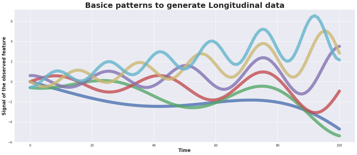
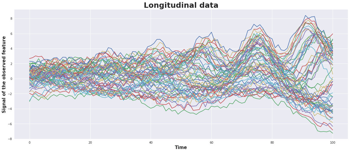
As input we generate 6 basic patterns and for each of them 10 time series.
For the basic patterns a damped sin-wave is used with a superposed linear trend. The basic patterns may differ in amplitude, frequancy, phase, slope. The 10 times series of each of them are generated by adding some random noise.
#---- number of time series
nT = 101  # number of observational point in a time series
nC = 6    # number of charakteristic  signal groups
mG = 10   # number of time series in a charakteristic signal group

#---- control parameters for data generation
Am = 0.3; # amplitude of the signal
sg = 0.3  # rel. weight of the slope
eg = 0.02 # rel. weight of the damping

#---- generate the data
basicSeries,timeSeries = generate_data(nT,nC,mG,Am,sg,eg)
plot_basicSeries(basicSeries)
plot_timeSeries(timeSeries)
Run the clustering and evaluate the dendogram
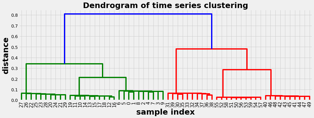
Example 1: Spearman correlation as distance metric
In this example we use the Spearman correlation as distance metric. We get a well balanced dendogram as a result. The dendogram should be read from top to down. It delivers a series of suggestions how the time series can be clusterd, indicated by the vertical lines. E.g.:
- with distance 0.6 we get 2 clusters
- with distance 0.3 we get 4 clusters
- with distance 0.15 we get 6 clusters
- at the bottom with distance 0 each time series is its own cluster
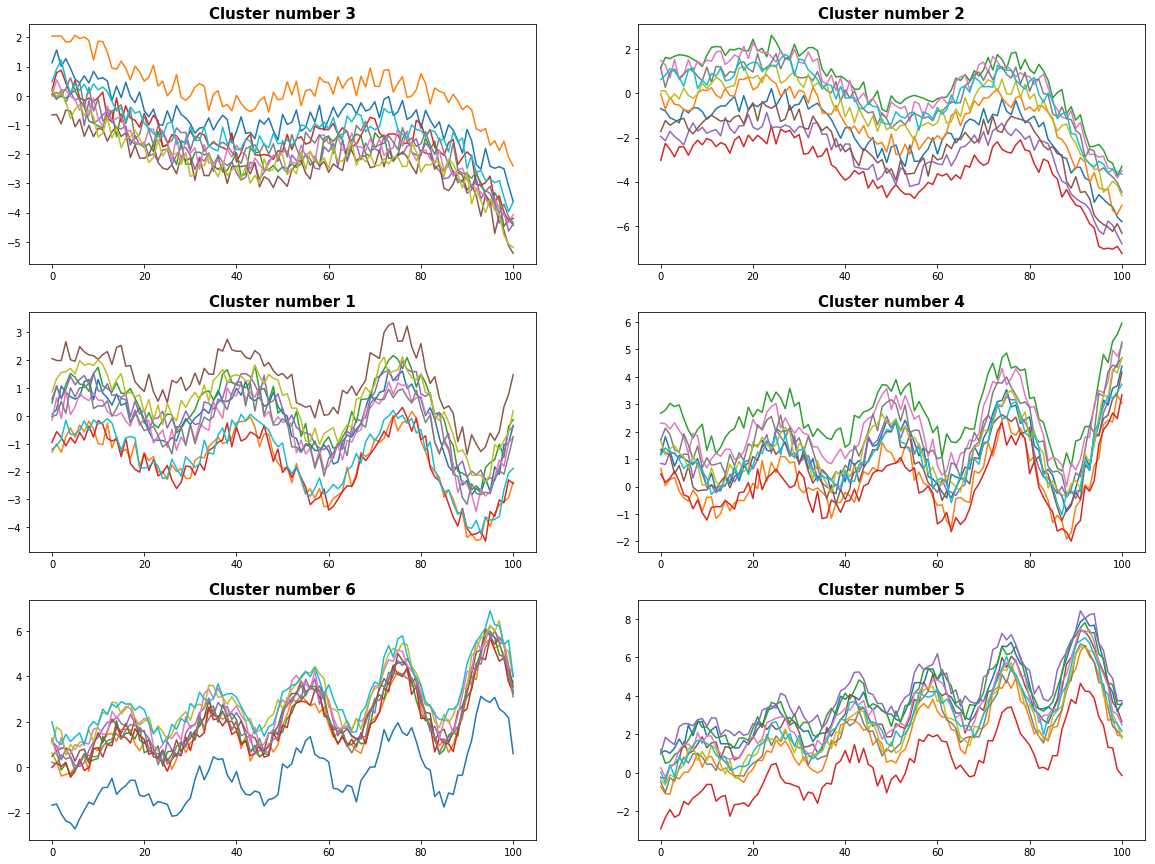
We evaluate the dendogram with 6 clusters. In the graphics below we can recognize the time series are properly separated and assigned to coherent clusters.
#--- Here we use spearman correlation as distance metric
def myMetric(x, y):
    r = stats.pearsonr(x, y)[0]
    return 1 - r

#--- run the clustering
D = hac.linkage(timeSeries, method='single', metric=myMetric)
plot_dendogram(D)

#---- evaluate the dendogram
cut_off_level = 6   # level where to cut off the dendogram
plot_results(timeSeries, D, cut_off_level)
0 Cluster number 3 has 10 elements
1 Cluster number 2 has 10 elements
2 Cluster number 1 has 10 elements
3 Cluster number 4 has 10 elements
4 Cluster number 6 has 10 elements
5 Cluster number 5 has 10 elements
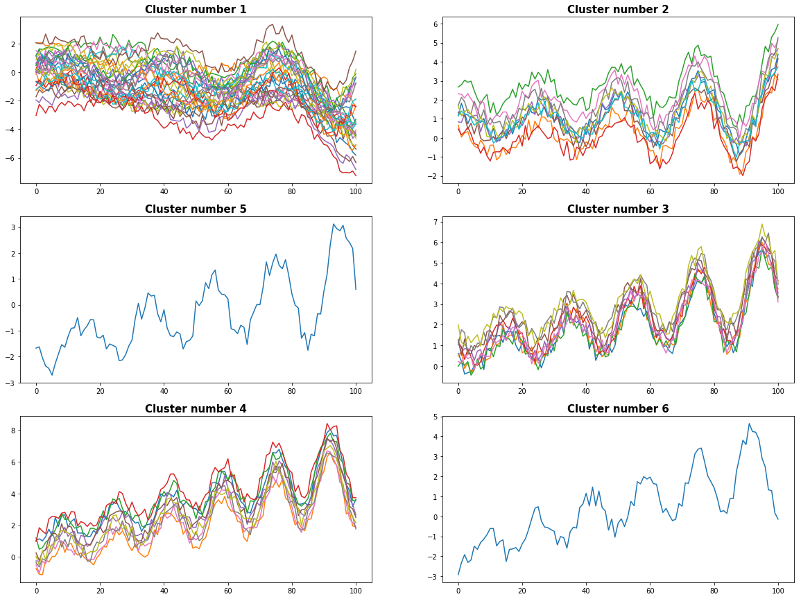
Example 2: Euclidean distance as metric
With the same data as in example 1 we use now the Euclidean distance as metric. The dendogram is now less balanced and we have some difficulties to chose meaningful clusters.
#--- run the clustering
#D = hac.linkage(timeSeries, method='single', metric='correlation')
D = hac.linkage(timeSeries, method='single', metric='euclidean')
plot_dendogram(D)

#---- evaluate the dendogram
cut_off_level = 6   # level where to cut off the dendogram
plot_results(timeSeries, D, cut_off_level)
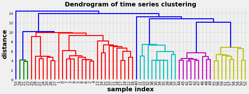
0 Cluster number 1 has 30 elements
1 Cluster number 2 has 10 elements
2 Cluster number 5 has 1 elements
3 Cluster number 3 has 9 elements
4 Cluster number 4 has 9 elements
5 Cluster number 6 has 1 elements
If we want to decide what kind of correlation to apply or to use another distance metric, then we can provide a custom metric function:
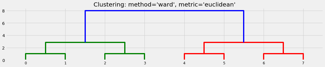
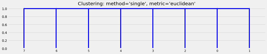
The basics of cluster analysis
Cluster analysis (or clustering) is the task of grouping a set of objects in such a way that objects in the same group - called a cluster - are in some sense similar. Cluster analysis is a general task to be solved and not a specific algorithm. It can be achieved by various algorithms that differ significantly in their notion of what constitutes a cluster and how to efficiently find them.
We set up a very simple collection of objects:
We can see that different algorithms generate different suggestions about the clusters:
X = np.array([])
X = [[i] for i in [0, 1, 2, 3, 4, 5, 6, 7]]
plot_basic_cluster(X)
Python code
import math
import numpy as np
import pandas as pd
import scipy.cluster.hierarchy as hac
import matplotlib.pyplot as plt
import matplotlib.gridspec as gridspec

def generate_data(nT,nC,mG,A,sg,eg):
    timeSeries = pd.DataFrame()
    basicSeries = pd.DataFrame()
    β = 0.5*np.pi
    ω = 2*np.pi/nT
    t = np.linspace(0,nT,nT)
    for ic,c in enumerate(np.arange(nC)):
        slope = sg*(-(nC-1)/2 + c)
        s = A * (-1**c -np.exp(t*eg))*np.sin(t*ω*(c+1) + c*β) + t*ω*slope
        basicSeries[ic] = s
        sr = np.outer(np.ones_like(mG),s)
        sr = sr + 1*np.random.rand(mG,nT) + 1.0*np.random.randn(mG,1)
        timeSeries = timeSeries.append(pd.DataFrame(sr))
    return basicSeries, timeSeries

def plot_basicSeries(basicSeries):
    with plt.style.context('seaborn'):      # 'fivethirtyeight'
         fig = plt.figure(figsize=(20,8)) ;
         ax1 = fig.add_subplot(111);
         plt.title('Basice patterns to generate Longitudinal data',fontsize=25, fontweight='bold')
         plt.xlabel('Time', fontsize=15, fontweight='bold')
         plt.ylabel('Signal of the observed feature', fontsize=15, fontweight='bold')
         plt.plot(basicSeries, lw=10, alpha = 1.8)

def plot_timeSeries(timeSeries):
    with plt.style.context('seaborn'):      # 'fivethirtyeight'
         fig = plt.figure(figsize=(20,8)) ;
         ax1 = fig.add_subplot(111);
         plt.title('Longitudinal data',fontsize=25, fontweight='bold')
         plt.xlabel('Time', fontsize=15, fontweight='bold')
         plt.ylabel('Signal of the observed feature', fontsize=15, fontweight='bold')
         plt.plot(timeSeries.T)
         #ax1 = sns.tsplot(ax=ax1, data=timeSeries.values, ci=[68, 95])

def plot_dendogram(Z):
    with plt.style.context('fivethirtyeight' ):
         plt.figure(figsize=(15, 5))
         plt.title('Dendrogram of time series clustering',fontsize=25, fontweight='bold')
         plt.xlabel('sample index', fontsize=25, fontweight='bold')
         plt.ylabel('distance', fontsize=25, fontweight='bold')
         hac.dendrogram( Z, leaf_rotation=90.,    # rotates the x axis labels
                            leaf_font_size=15., ) # font size for the x axis labels
        plt.show()

def plot_results(timeSeries, D, cut_off_level):
    result = pd.Series(hac.fcluster(D, cut_off_level, criterion='maxclust'))
    clusters = result.unique()
    figX = 20; figY = 15
    fig = plt.subplots(figsize=(figX, figY))
    mimg = math.ceil(cut_off_level/2.0)
    gs = gridspec.GridSpec(mimg,2, width_ratios=[1,1])
    for ipic, c in enumerate(clusters):
        cluster_index = result[result==c].index
        print(ipic, "Cluster number %d has %d elements" % (c, len(cluster_index)))
        ax1 = plt.subplot(gs[ipic])
        ax1.plot(timeSeries.T.iloc[:,cluster_index])
        ax1.set_title(('Cluster number '+str(c)), fontsize=15, fontweight='bold')
    plt.show()

def plot_basic_cluster(X):
    with plt.style.context('fivethirtyeight' ):
         plt.figure(figsize=(17,3))
         D1 = hac.linkage(X, method='ward', metric='euclidean')
         dn1= hac.dendrogram(D1)
         plt.title("Clustering: method='ward', metric='euclidean'")

         plt.figure(figsize=(17, 3))
         D2 = hac.linkage(X, method='single', metric='euclidean')
         dn2= hac.dendrogram(D2)
         plt.title("Clustering: method='single', metric='euclidean'")
         plt.show()